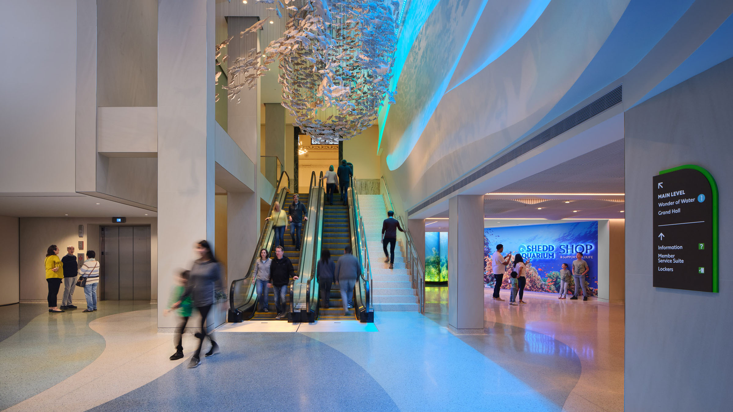
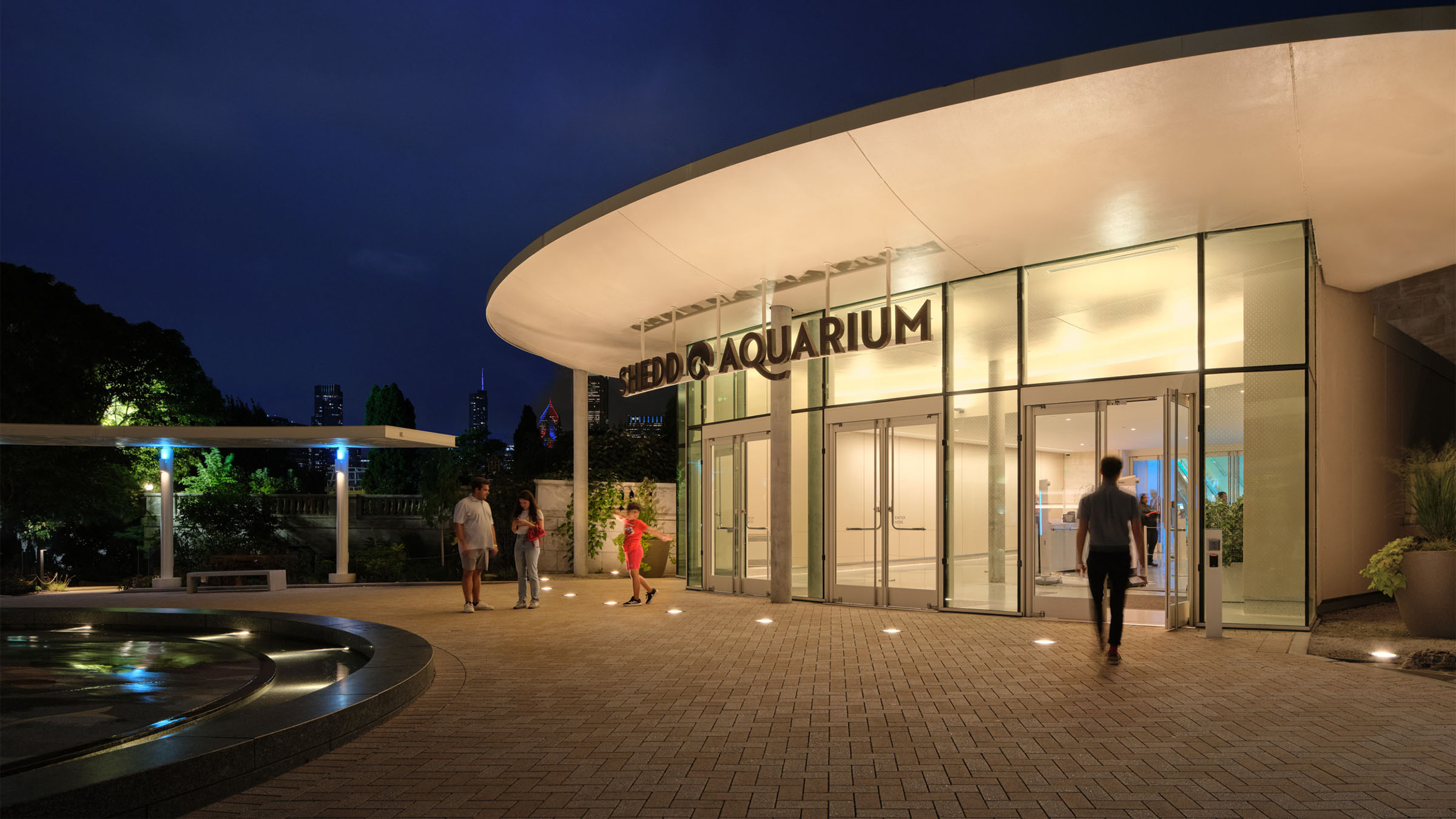
A comprehensive wayfinding redesign helps visitors navigate Shedd Aquarium’s historic building and complex additions with greater clarity and confidence.
We began with the visitor journey rather than individual signs, mapping destinations, circulation, and exhibit sequences. The resulting system helps visitors understand where they are, where to go next, and what else the Aquarium has to offer.
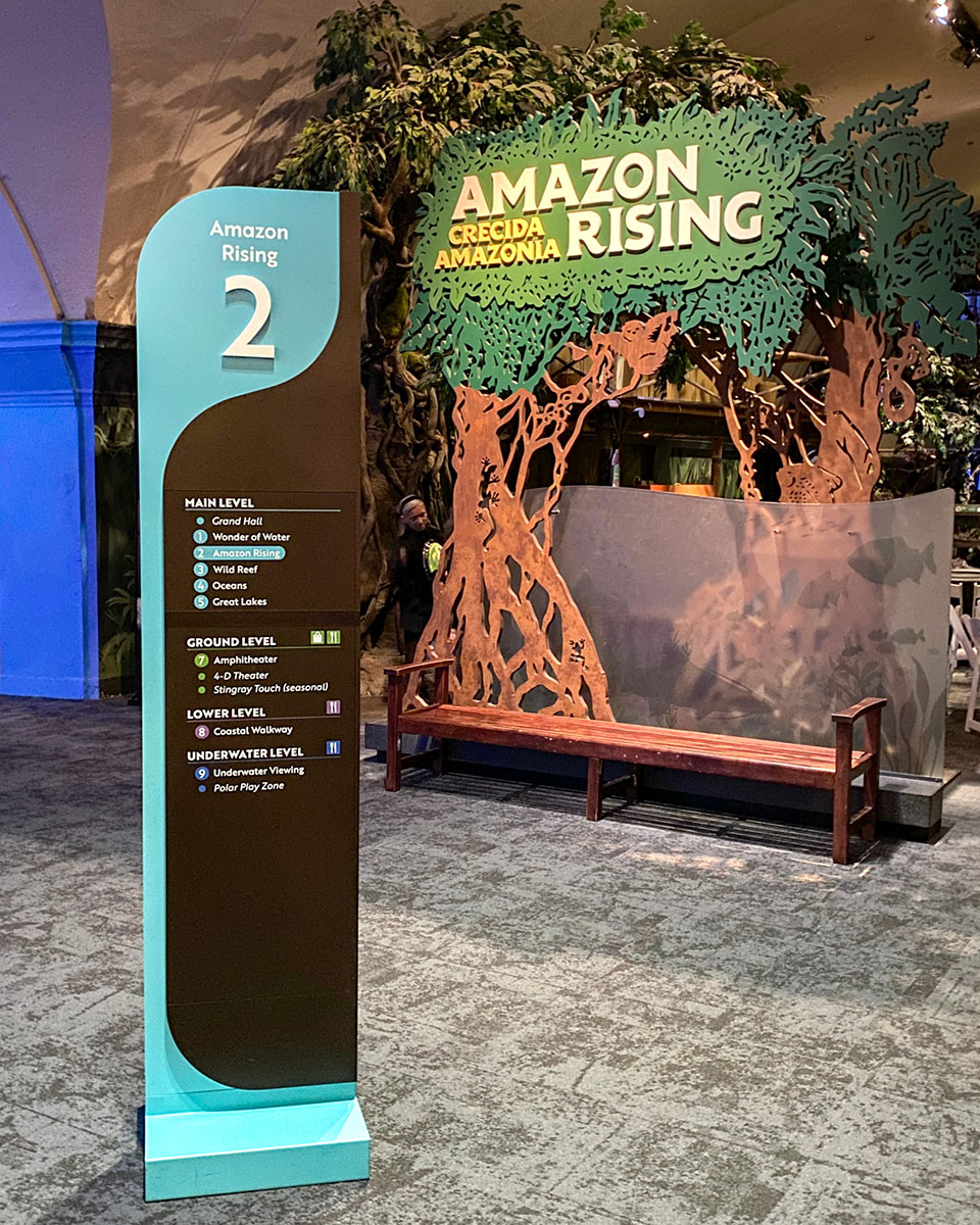
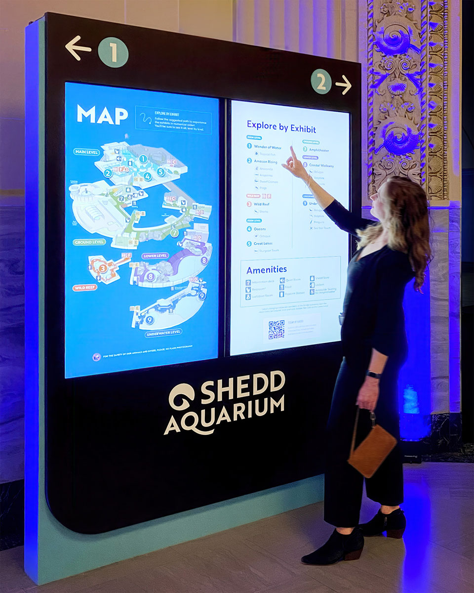
The redesigned system centers on sequentially numbered Shedd Highlights that guide visitors through major exhibits in an intuitive order. Color-coded floors, alphabetical vertical circulation, directional signage, and digital mapping stations create multiple layers of orientation. The signage family draws from Shedd’s existing typography, colors, and Aquaticus logo, extending the Aquarium’s identity into the visitor experience while adapting to its varied architecture.
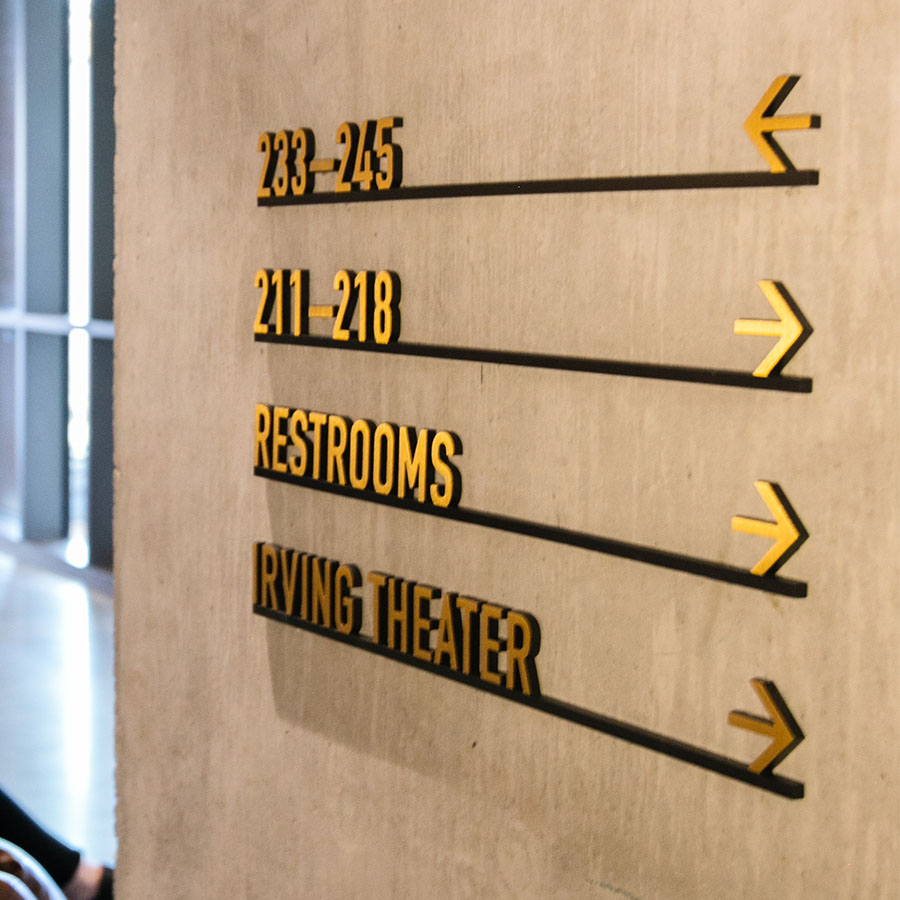
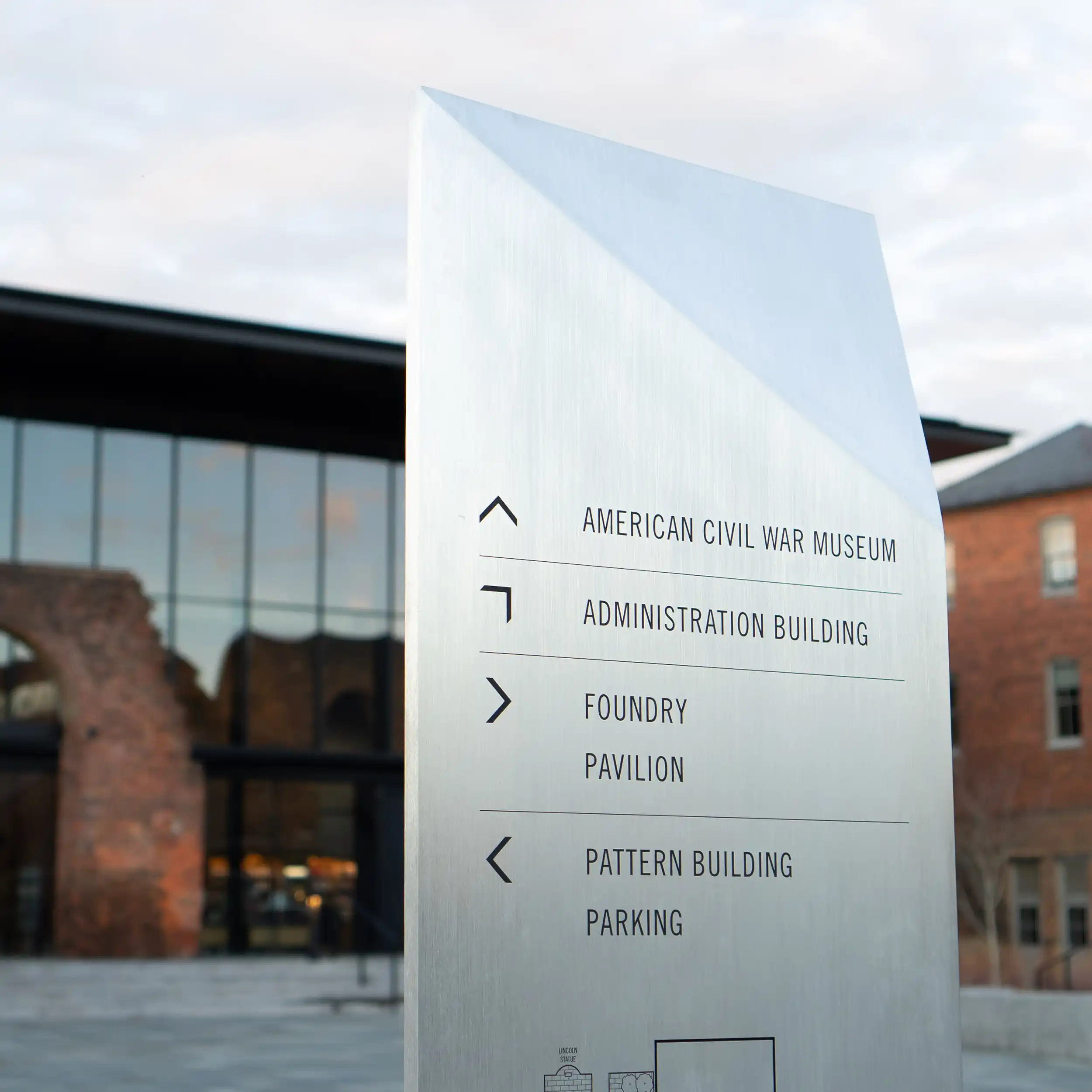
Sign types and mounting approaches were developed for the Aquarium’s wide range of architectural conditions.
A phased implementation plan allows improvements to align with renovations and limit unnecessary sign replacement.
Freshwater and saltwater-inspired accent colors help distinguish wayfinding elements throughout the Aquarium.