
Liberty Library
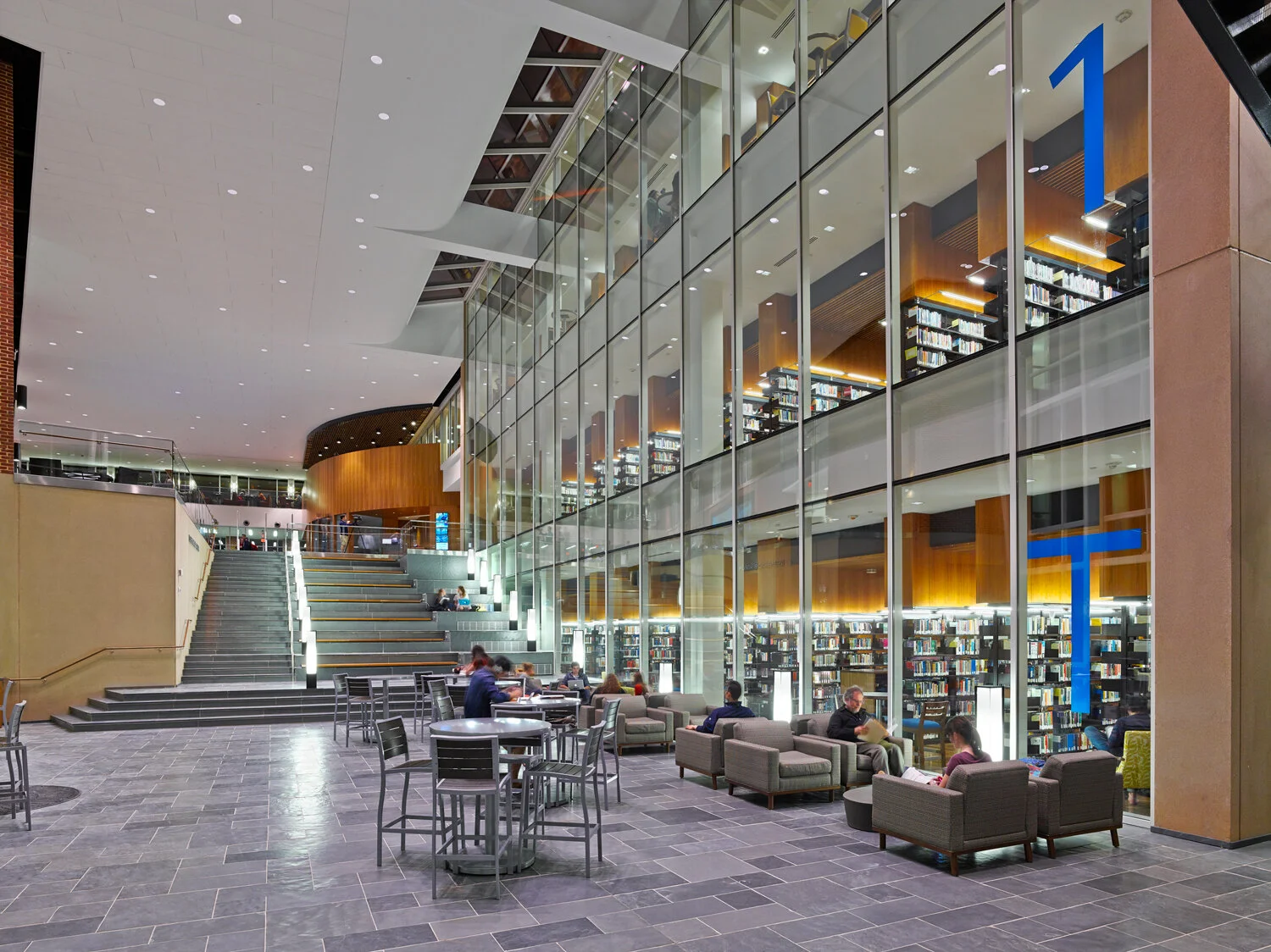
The comprehensive wayfinding package at Liberty University's Library integrates seamlessly into the architecture, using differences in color, scale, and material to create continuous navigation throughout the various collaborative spaces.
Client
Liberty University
Architect
VMDO Architects
Location
Lynchburg, VA
Scope
Wayfinding, Signage, Donor Recognition
Creating Visibility
Liberty University’s Library is a vibrant hub of student activity situated at the spatial and social heart of campus. As the first major new construction facility on the new quad, the project provided an opportunity for the university to revisit their campus signage standards.


In the library, the university's brand colors are used to create visual hierarchy in the floor designations while maintaining a connection to the campus as a whole. Using the university brand colors as a way to create a visual hierarchy and identity to floor designations became standard practice for wayfinding.
Creating a Comprehensive System
Signage and wayfinding strategies reinforce the architectural language of the building. In addition to clearly and creatively identifying the many destinations in the library, signage strategies assign a hierarchy of materials to enhance the navigation and use of space.


A gradation of color designates floors and a neutral palette of materials and colors complements the interior finishes to identify zones, rooms, and donors throughout the building.
Related Work